Can thoughtful design change the way we talk about feminine hygiene?
.png)
.png)
Design can't solve every problem.
But it can change how people experience it.
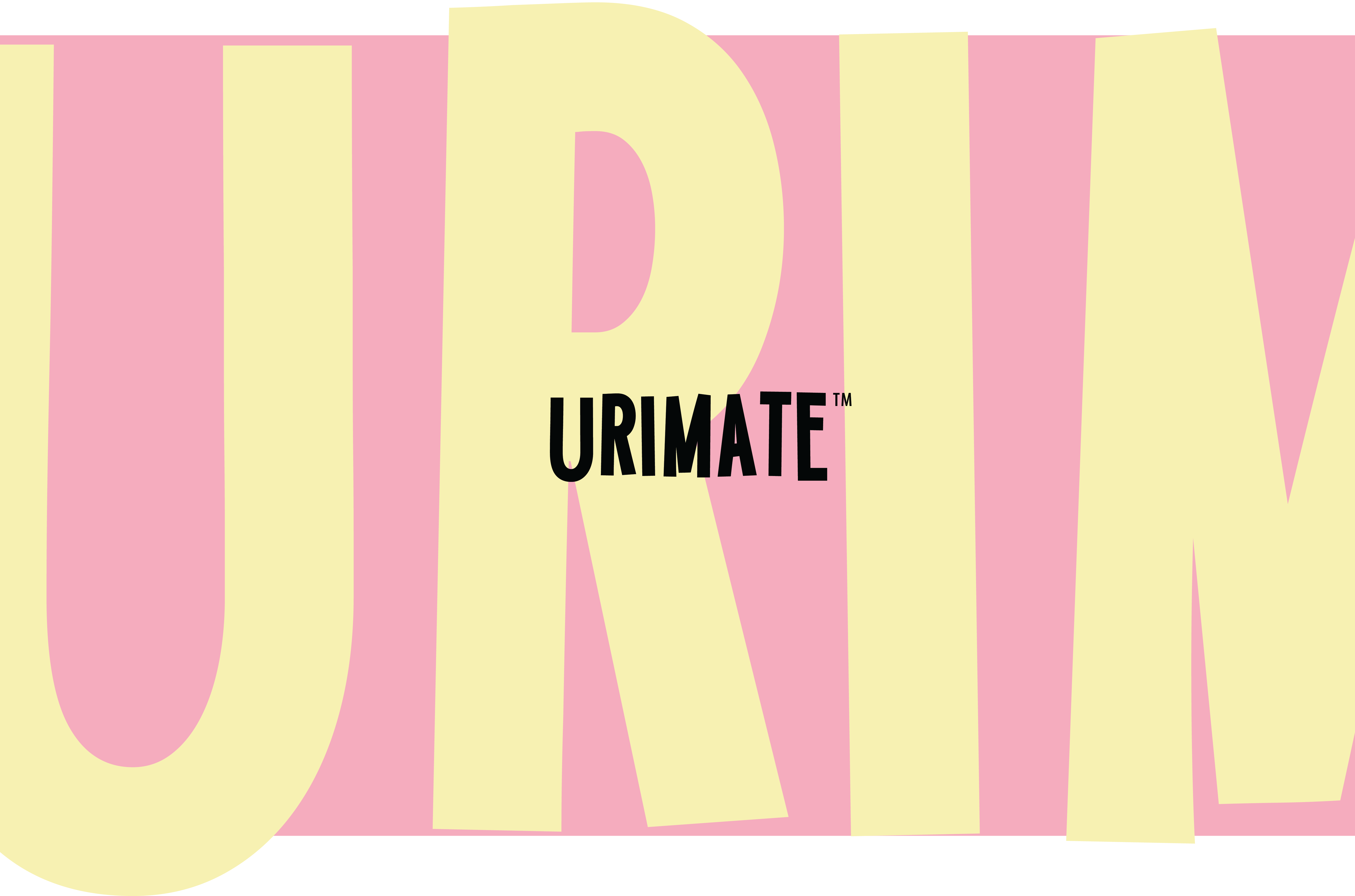
Conversations around feminine hygiene are often surrounded by discomfort, stigma and embarrassment. Many products communicate function, but very few create emotional comfort.
Instead of designing another healthcare brand, the focus was on creating an identity that feels approachable, modern and reassuring. The goal was to make care feel normal.
The character
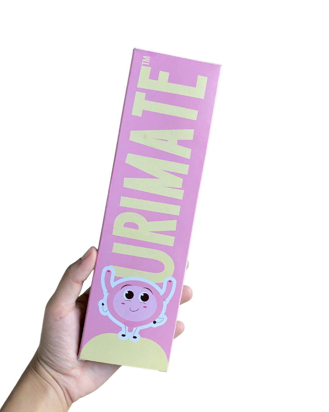
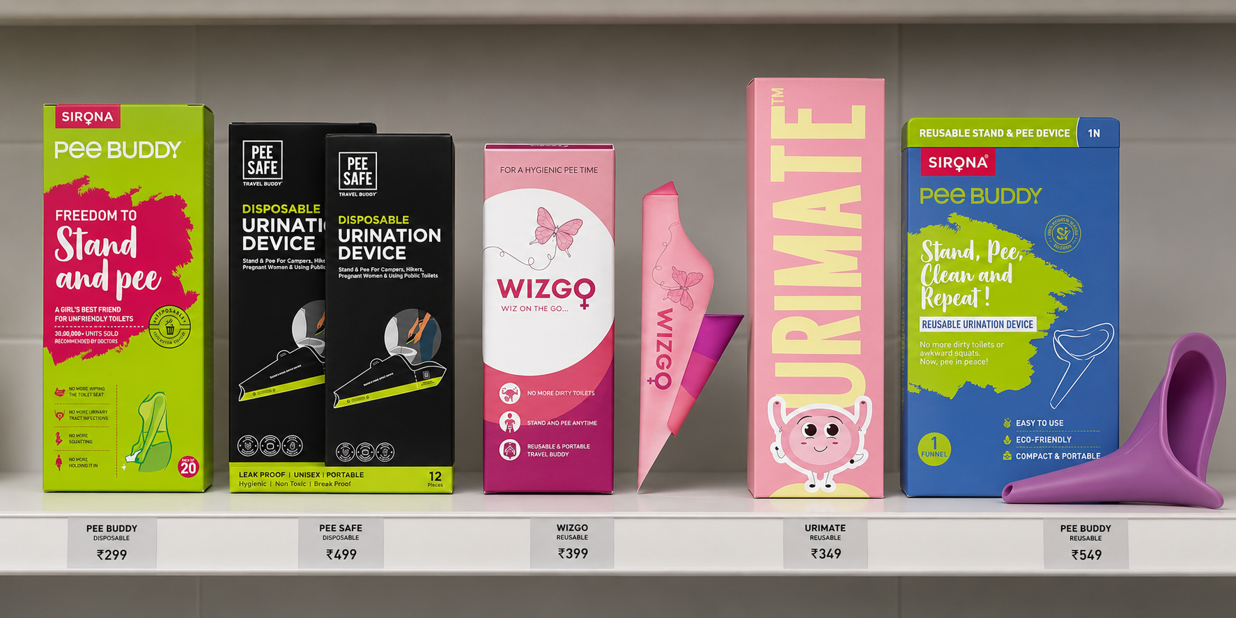
The mascot, inspired by the shape of a urinary bladder, brings a playful and friendly personality to the brand. It helps make an otherwise serious and sensitive topic feel light, approachable, and easy to talk about. By blending education with charm, the character makes the brand more relatable and adds a memorable, human touch to the packaging.

The design
The packaging design reflects this purpose — clear, minimal, and informative. It balances sensitivity with empowerment, using visuals and tone that make the product approachable, trustworthy, and discreet while standing out on shelves. The goal was to create something a woman would feel confident picking up.
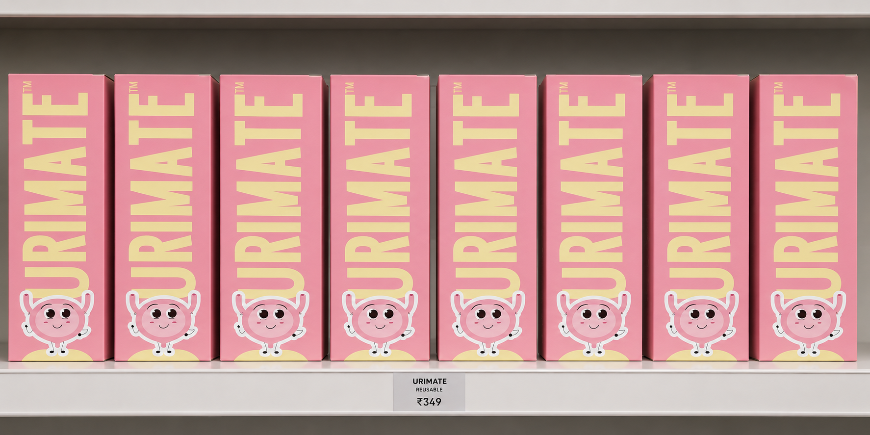
Which one are you most likely to buy?
This wasn't designed to remain a portfolio project.
It was designed to become part of someone's everyday routine.