 case study - brand identity & export design
rushabh enterprise.
A Rajkot workshop that manufactures to a named standard, needed a brand that could say so.
Rushabh Enterprise manufactures precision lubrication and fastening components, grease nipples, grease nipple caps, oil cups, grease cups, aluminium oil level indicators, industrial nylon knobs, and copper rivets, from a single integrated facility in Rajkot, one of India's foremost precision engineering hubs.
The manufacturing was already exact: every fitting machined to a named thread standard (DIN 71412, BS 1486, SAE J534), every batch lot-tracked and dimensionally inspected. What the business lacked was a visual identity that communicated that precision before a buyer ever placed an order, and a catalogue system that let an overseas procurement team qualify the company at a glance, not a phone call.
Kalpavriksha - growth, continuity, abundance.
The name and mark are built around Kalpavriksha, the wish-fulfilling tree of life in Jain philosophy, a symbol of growth that is patient rather than forced. The logo reads as a single seed-like form, but its centre opens into two mirrored roots curling inward: continuity built from the ground up, the same principle behind a company that grew from one Rajkot workshop into a seven-line manufacturer without ever changing what it stood for.

On light backgrounds

On dark backgrounds
A palette pulled from soil, metal, and rust, not a swatch book.
Deep olive grounds the mark the way iron tools weather into a workshop floor. Terracotta and brown carry the warmth of raw material and rust, precision engineering's actual palette, long before it's machined smooth. Cream keeps every application legible on paper, packaging, or screen.
Deep Olive
#383F28
Terracotta
#9B4622
Warm Brown
#7E654A
Parchment Cream
#E4D7C7
A display face for confidence, a body face for the fine print that actually matters.
Headers carry a bold geometric display face for the same reason a spec sheet leads with the standard, not the disclaimer. Body copy runs in General Sans, a clean grotesque built to stay legible at the small sizes a thread-size table or tolerance spec demands.
Aa
Aa
One page template, engineered like the parts it describes.
Every product spread runs the same system: a full-bleed application photograph, a line-drawn technical icon, a specification table, and the industries the part actually serves, so a buyer scanning a hundred-page catalogue can qualify a component in seconds, without a call to the export desk.
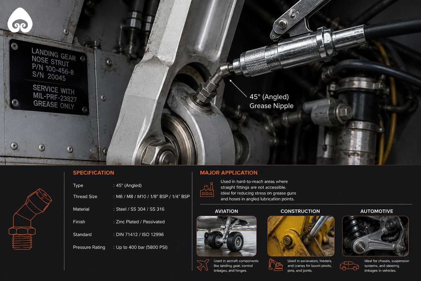
45° angled grease nipple - full specification spread
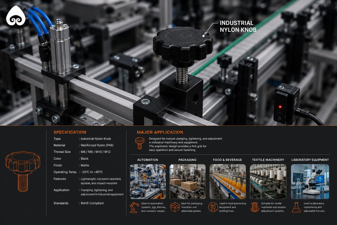
Industrial nylon knob - full specification spread
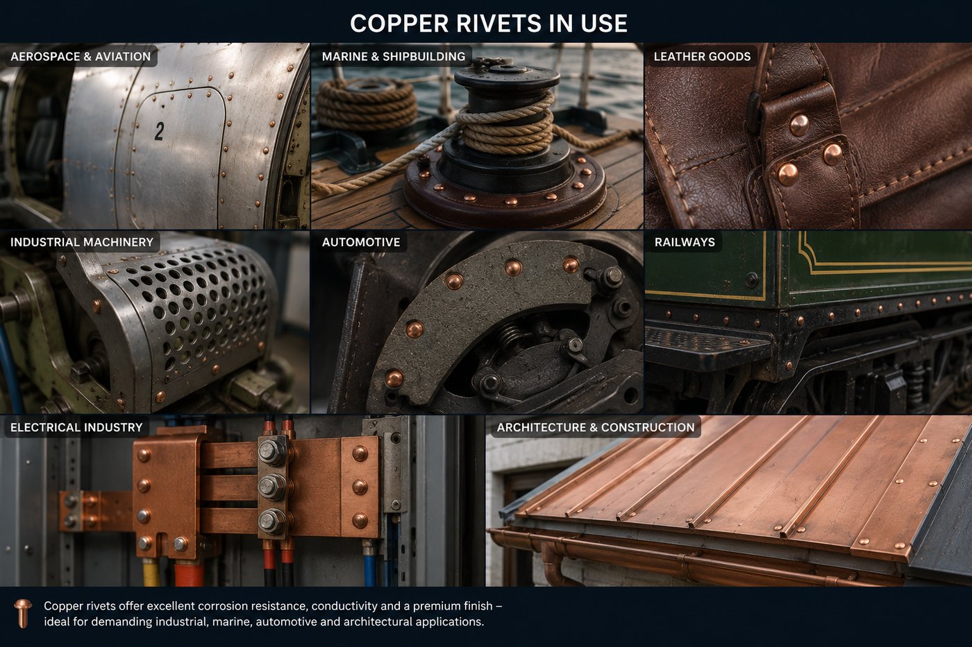
Copper rivets - cross-industry application grid
Seven product lines, photographed as one family.
From the flagship grease nipple cap to solid copper rivets, every line was shot and framed consistently, so the range reads as a single manufacturer's catalogue rather than seven disconnected products.
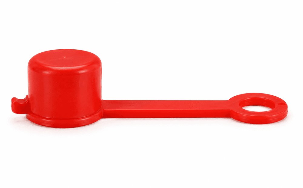
Grease Nipple Caps
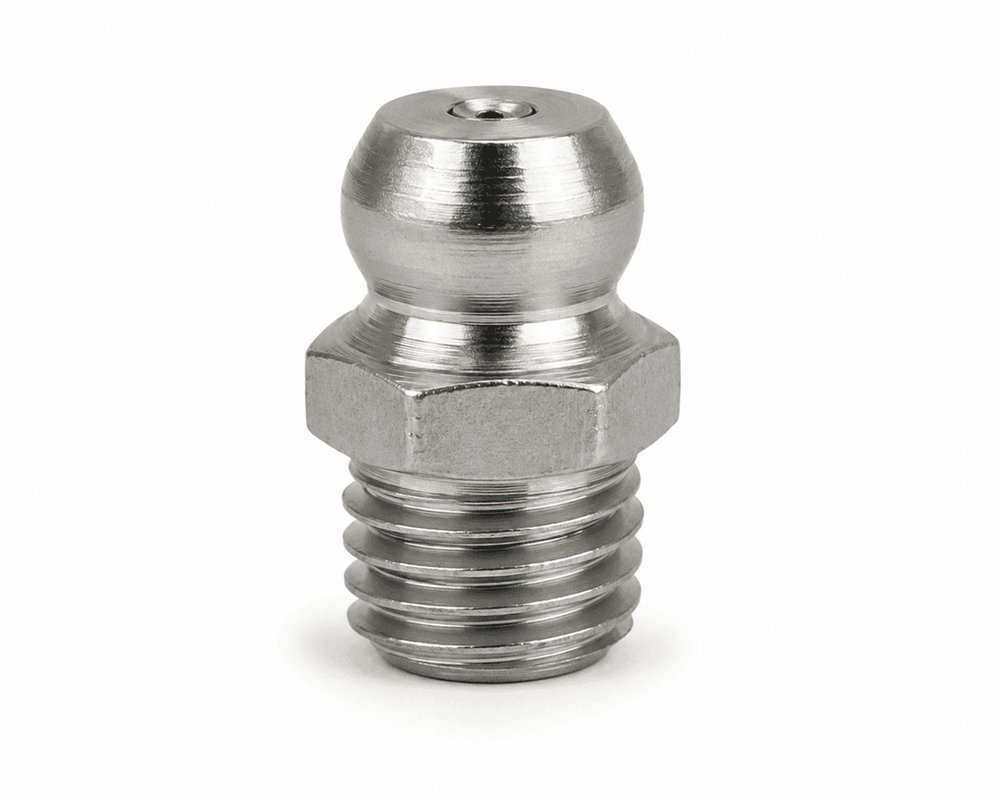
Grease Nipples
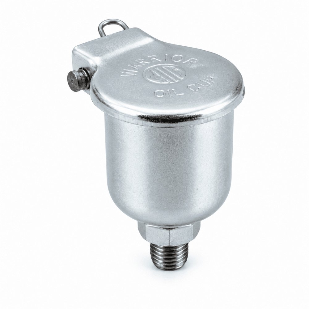
Oil Cups
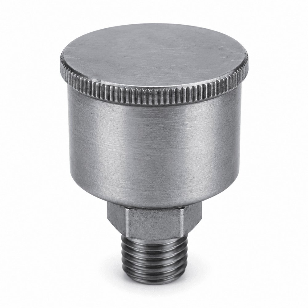
Grease Cups
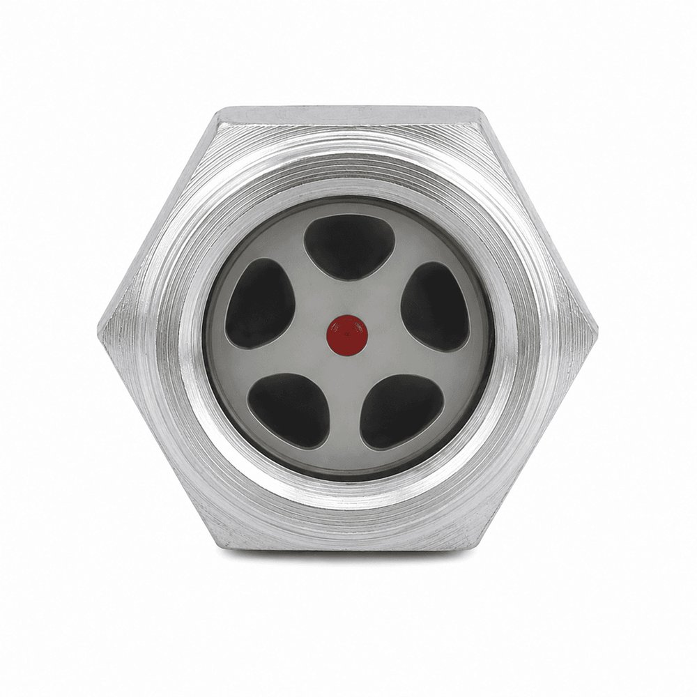
Oil Level Indicators
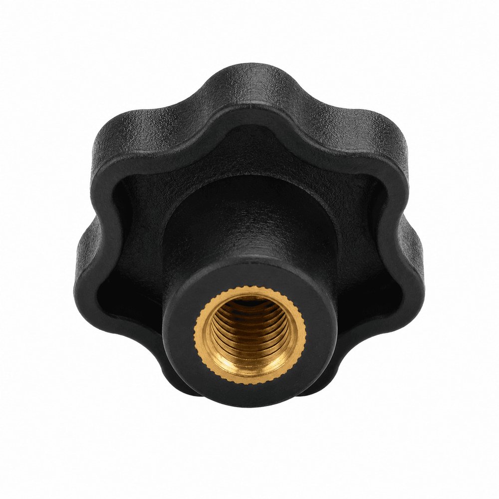
Industrial Nylon Knobs
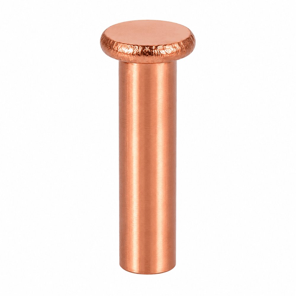
Copper Rivets
An export desk that never closes.
The identity carries onto an export-facing website built for the buyer who is qualifying Rushabh from another continent: full specification pages per product, a quality standards reference cross-checked against the thread standard their own engineers already use, and a direct line to the export desk, no distributor, no reseller markup.
Visit rushabhexports.com →| Standard | Origin | Thread type | Primary markets |
|---|---|---|---|
| DIN 71412 | Germany | Metric parallel | Europe & India |
| BS 1486 | United Kingdom | BSP taper | UK, Middle East, Commonwealth |
| SAE J534 | USA | NPT taper | North America |